Overview
Project overview
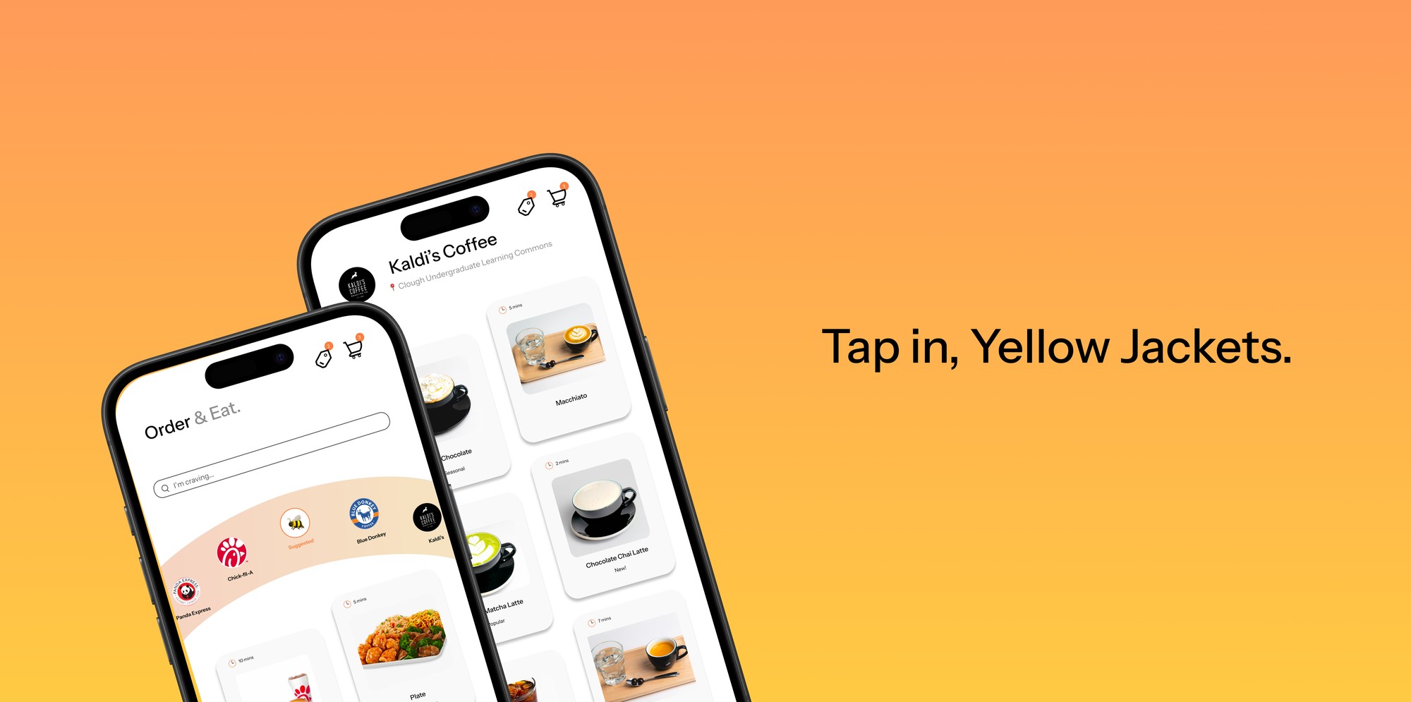
Georgia Tech’s mobile ordering app turned a quick, everyday task into a frustrating one, with cluttered screens and confusing navigation. In two weeks, I redesigned the experience into a clean, guided flow that takes students from browsing to checkout in four simple steps.
Problem
What needed solving
Georgia Tech’s mobile food ordering app suffered from poor UI design and unclear navigation, making a simple task unnecessarily frustrating. Inconsistent layouts, confusing flows, and formatting issues reduced usability and created friction in a high-frequency experience.
This project focuses on redesigning the app to deliver a cleaner interface and a more intuitive, streamlined ordering process.
Design challengeHow might we make ordering food on campus feel as quick and effortless as it should, for students rushing between classes?
Process
How it came together
01Looking for inspiration
I studied popular food delivery apps and Dribbble concepts to see how the best ordering experiences handle browsing, menus, and checkout. I paid attention to a few patterns that kept coming up:
- Food-first visuals: large photos that make choosing feel easy.
- Scannable browsing: restaurants in a quick horizontal row, with menu items in clear cards below.
- Short checkout: one review screen before paying.
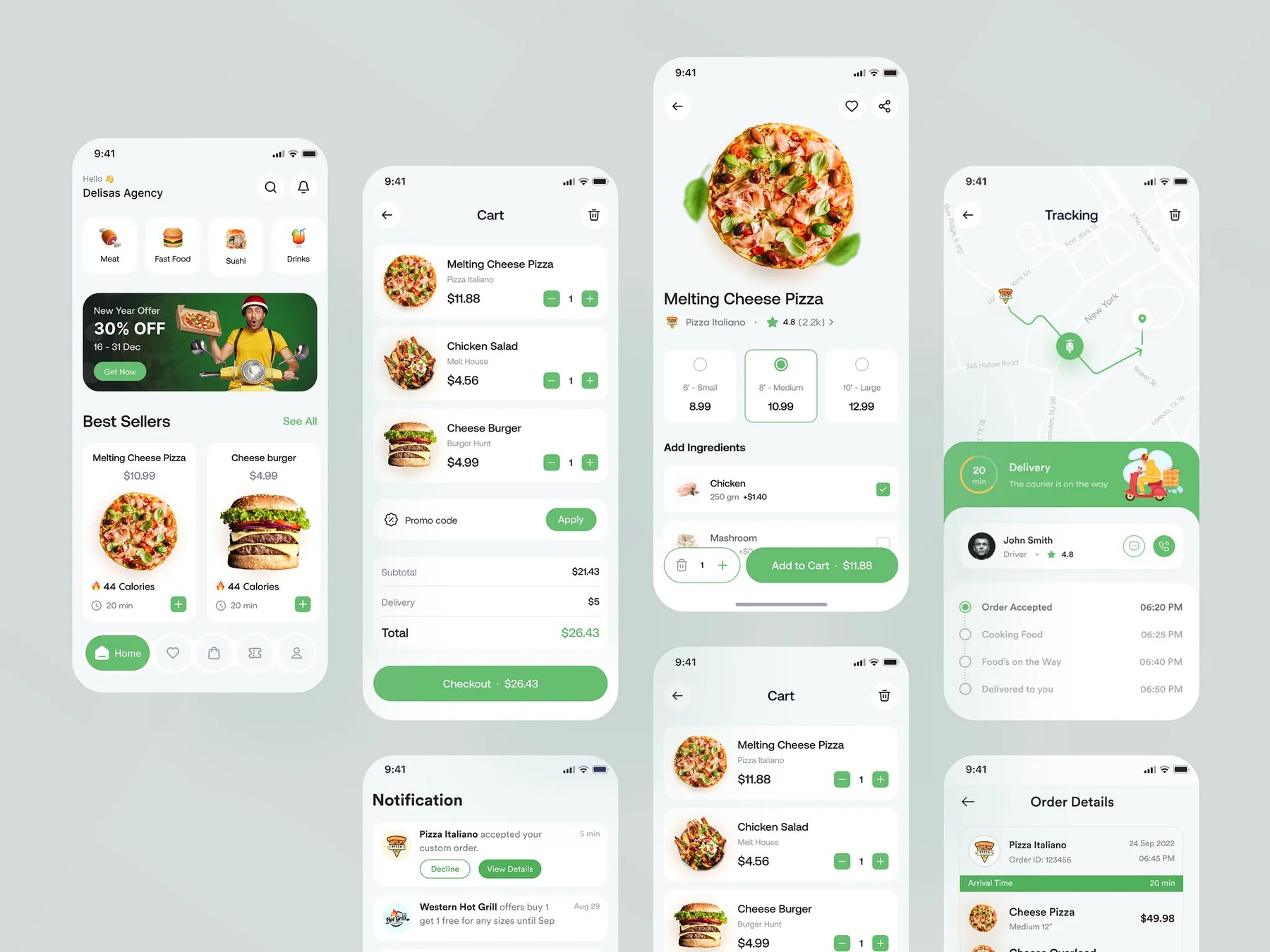
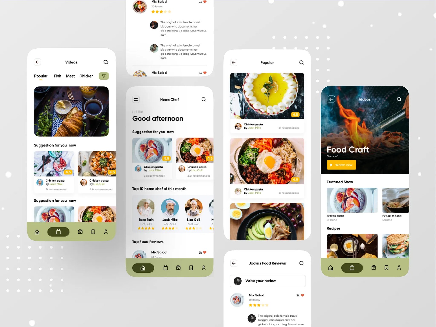
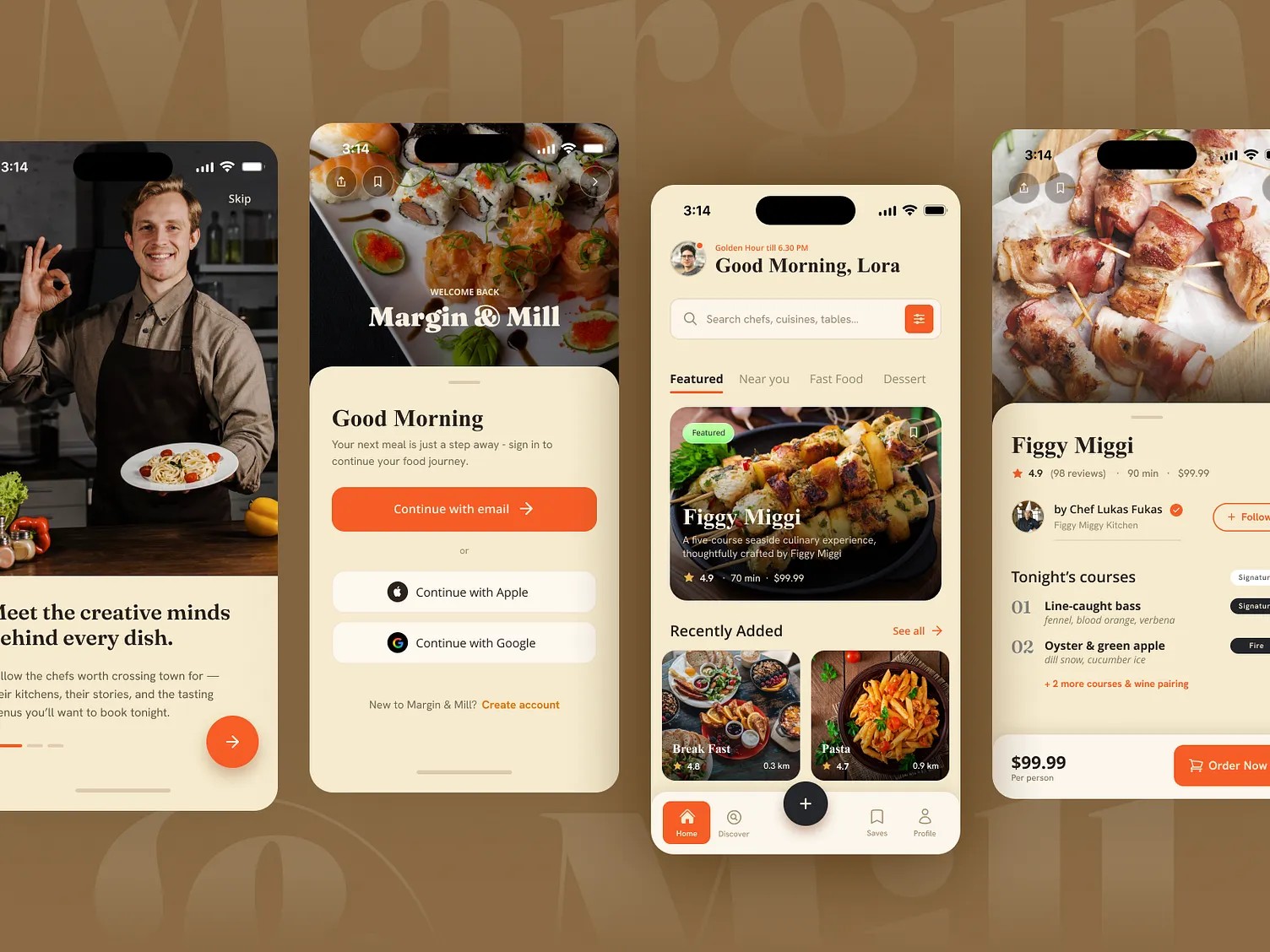
References: food app concepts from Dribbble, collected for layout and flow patterns. Not my work.
02Prototyping the flow
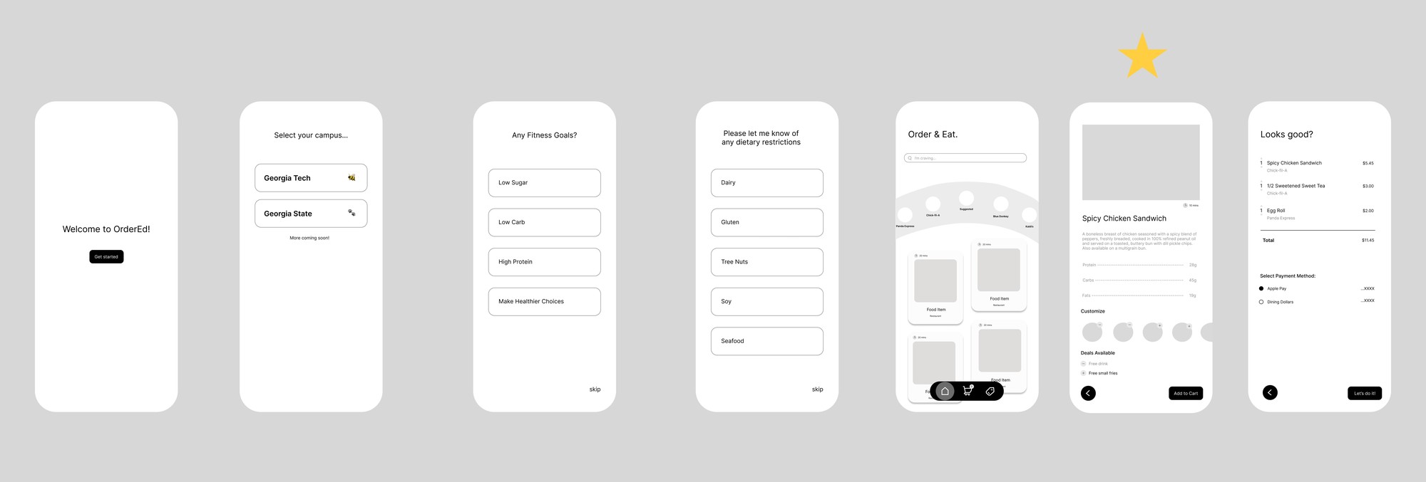
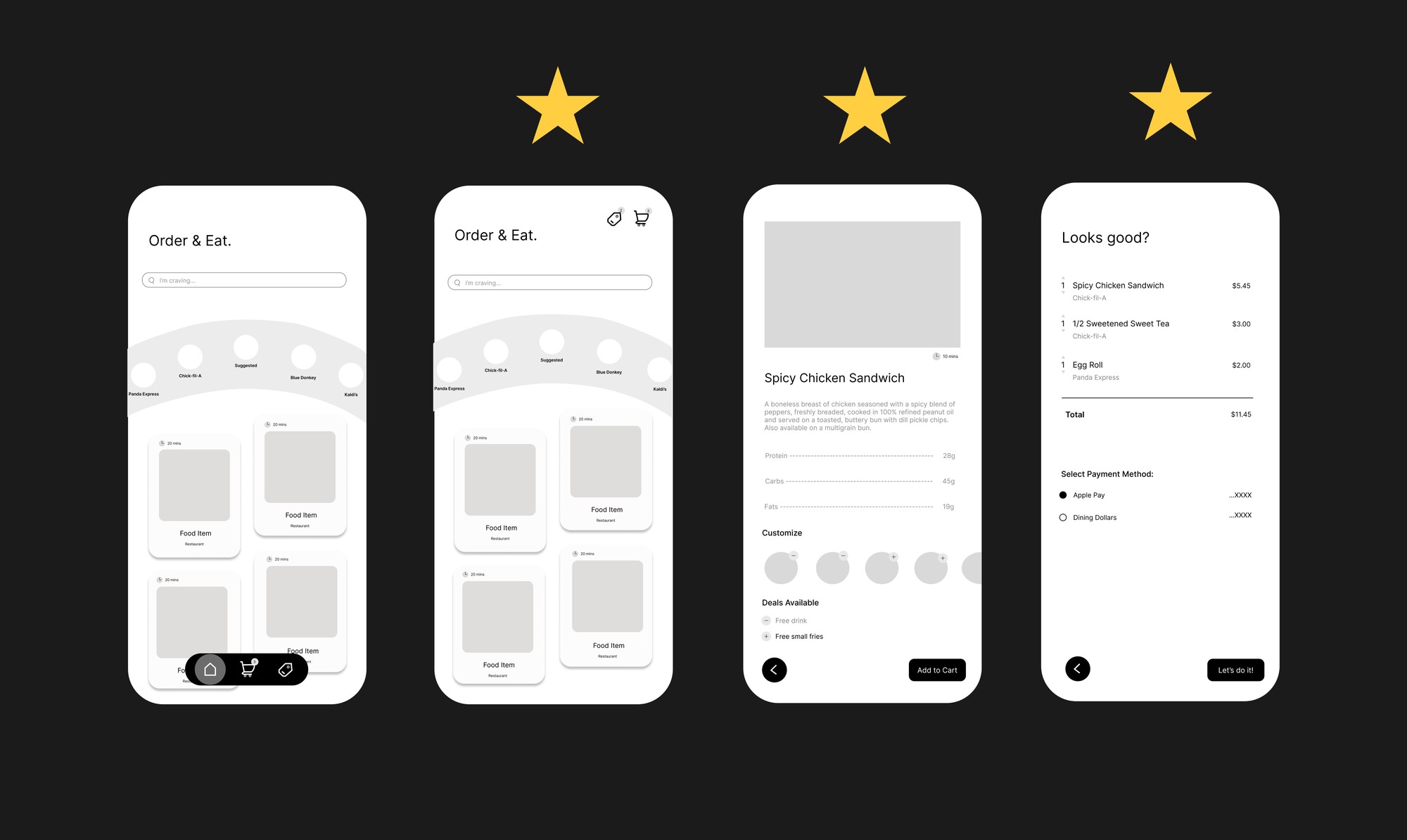
Next, I wireframed the full journey in grayscale, so I could focus on structure before style.
- Onboarding: students pick their campus, then set fitness goals and dietary restrictions, so the app can recommend food that fits them.
- Browse: a search bar and a curved carousel of campus restaurants, with item cards showing prep time.
- Item detail: nutrition (protein, carbs, fats), customizations, and available deals in one place.
- Checkout: a single “Looks good?” review screen with payment options.
03Adding color and an app icon
For the visual identity, I chose a warm orange-to-gold gradient, a nod to Georgia Tech’s gold and the Yellow Jackets. I explored icon directions from a simple shopping bag to a hand-drawn bee carrying food, keeping the campus spirit front and center.
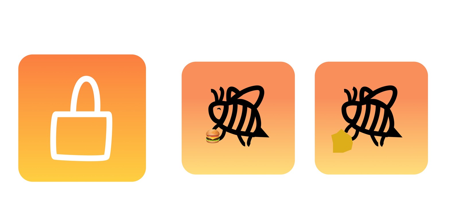
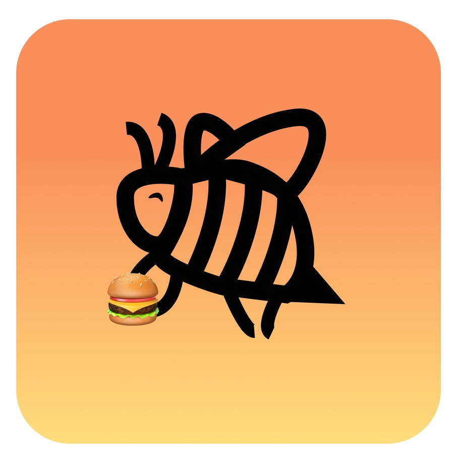
Icon explorations, and the final bee icon carrying a burger.
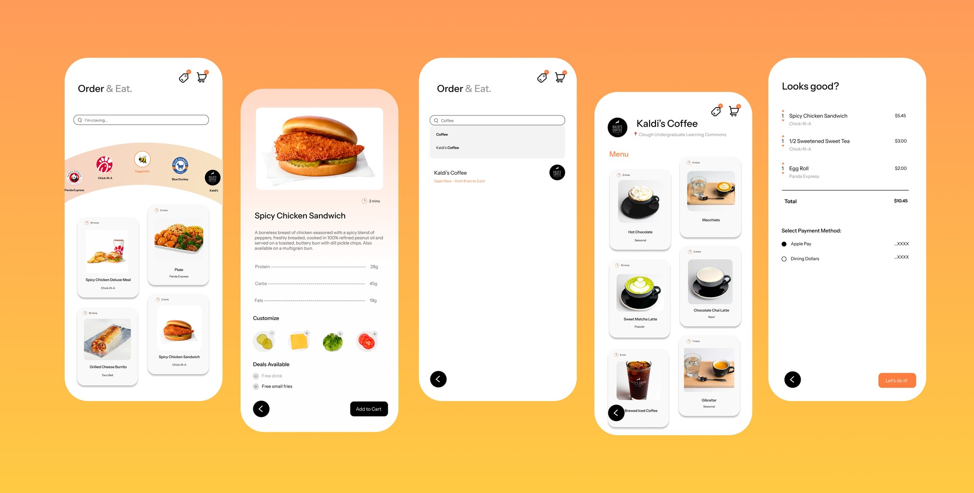
Final design
Tap in, Yellow Jackets.
The final design turns ordering into a guided, four-step flow built around how students actually eat on campus.
What’s next
If I kept going
Next, I’d run usability tests with Georgia Tech students and compare how long ordering takes in the current app versus OrderEd. I’d also add order tracking, so students know exactly when their food is ready.